
lockup
The standard logo: the wizard beside the pixel wordmark.
Clear space: the height of the h in the name, on every side. Minimum width: 190 px on screen, 50 mm in print.
Everything the hackers&wizards brand is made of: tokens, logos, the files made from them and the press kit. Each system shows its components on its own design-system page.
brand v0.33.0 · tokens/tokens.css, manifest.json, applications/, press/ · 55 entries
@hackersandwizards/slides; its slide types are in its catalog, under Slides. Documents come from the document engine, @hackersandwizards/documents, under Documents.@import "@hackersandwizards/brand/tokens.css";, the rest in README.md.| Source | Refresh |
|---|---|
| Tokens | bun run tokens |
| Logo cuts | bun scripts/outline.ts |
| This page | bun run dev |
Each hue has a base, a text colour on light, one colour on night, and two tints. Text on light clears 4.5:1 on bg and white, night clears 4.5:1 on night and night-2.
| Base | Text on light | Night | Tint 7 % | Tint 40 % |
|---|---|---|---|---|
teal | teal-dark | teal-night | 7 % | 40 % |
purple | purple | purple-night | 7 % | 40 % |
amber | amber-dark | amber | 7 % | 40 % |
green | green-dark | green | 7 % | 40 % |
factory | factory | factory-light | 7 % | 40 % |
red | red | red-night | 7 % | 40 % |
ampersand | muted | ampersand-light | 7 % | 40 % |
Series take this order, --chart-1 to --chart-6; on night each takes its hue's night colour.
tealpurpleamber-darkgreen-darkfactoryampersand--type-display-*Agentic Engineering, from the first prompt to the factory
--type-h1-*Agentic Engineering, from the first prompt to the factory
--type-h2-*Agentic Engineering, from the first prompt to the factory
--type-h3-*Agentic Engineering, from the first prompt to the factory
--type-h4-*Agentic Engineering, from the first prompt to the factory
--type-lead-*Agentic Engineering, from the first prompt to the factory
--type-body-*Agentic Engineering, from the first prompt to the factory
--type-small-*Agentic Engineering, from the first prompt to the factory
--type-label-*Agentic Engineering, from the first prompt to the factory
--type-stat-*Agentic Engineering, from the first prompt to the factory
--type-code-*Agentic Engineering, from the first prompt to the factory
The brand corner, --radius-brand, goes on every surface large enough to show it at its full value.
Smaller marks, a colour swatch or a list marker, are square, never a scaled corner.
Delivered
Icons are Lucide line icons in the colour of their text, never emoji. A kind of label carries an icon on every value or on none.
| Token | Value | Preview |
|---|---|---|
--radius-sm | 5px | |
--radius-brand | 20px 5px | |
--radius-pill | 9999px |
| Token | Value | Preview |
|---|---|---|
--font-mono | "JetBrains Mono Variable", ui-monospace, "SF Mono", "Cascadia Code", Menlo, monospace | |
--font-code | "JetBrains Mono Variable", ui-monospace, "SF Mono", "Cascadia Code", Menlo, monospace | |
--font-sans | "Inter Variable", "Inter", system-ui, -apple-system, "Segoe UI", Roboto, Helvetica, Arial, sans-serif |
| Token | Value | Preview |
|---|---|---|
--tracking-label | 0.06em |
| Token | Value | Preview |
|---|---|---|
--leading-none | 1 |
| Token | Value | Preview |
|---|---|---|
--spacing-gutter | max(round(clamp(1rem, 0.413rem + 2.6087vw, 2.5rem), 1px), env(safe-area-inset-left), env(safe-area-inset-right)) | |
--spacing-section | clamp(3rem, 1.8261rem + 5.2174vw, 6rem) | |
--spacing-header | calc(3px + 4.75rem + 1px + env(safe-area-inset-top)) | |
--spacing-strip | 3px | |
--spacing-header-row | 3.5rem | |
--spacing-logo | 2rem | |
--spacing-app-header | calc(var(--spacing-strip) + var(--spacing-header-row) + 1px + env(safe-area-inset-top)) | |
--spacing-hero | clamp(2.5rem, 2.1087rem + 1.7391vw, 3.5rem) | |
--spacing-section-head | clamp(2rem, 1.6087rem + 1.7391vw, 3rem) | |
--spacing-stack | clamp(1.5rem, 0.913rem + 2.6087vw, 3rem) | |
--spacing-grid | clamp(1rem, 0.6087rem + 1.7391vw, 2rem) | |
--spacing-card | min(clamp(1.25rem, 0.9565rem + 1.3043vw, 2rem), clamp(20px, 15.304px + 1.3043vw, 32px)) |
| Token | Value | Preview |
|---|---|---|
--container-content | 72rem | |
--container-wide | 84rem | |
--container-measure | 33em | |
--container-measure-h1 | 18ch | |
--container-measure-h2 | 26ch |
| Token | Value | Preview |
|---|---|---|
--breakpoint-xs | 25rem | |
--breakpoint-header-cta | 30rem |
| Token | Value | Preview |
|---|---|---|
--logo-wizard-lift | -7.8% |
| Token | Value | Preview |
|---|---|---|
--shadow-card | 0 2px 4px rgba(0, 0, 0, 0.05) | |
--shadow-overlay | 0 18px 46px rgb(25 40 58 / 0.1) |
| Token | Value | Preview |
|---|---|---|
--code-bg | var(--color-night) | |
--code-fg | var(--color-night-ink) | const x = 1; |
--code-comment | var(--color-night-subtle) | const x = 1; |
--code-keyword | var(--color-purple-night) | const x = 1; |
--code-string | var(--color-teal-night) | const x = 1; |
--code-inserted | var(--color-green) | const x = 1; |
--code-deleted | var(--color-red-night) | const x = 1; |
| Token | Value | Preview |
|---|---|---|
--motion-fast | 150ms ease | |
--motion-duration-draw | 1.3s | |
--motion-duration-line | 650ms | |
--motion-duration-tune | 7s | |
--motion-ease-brand | cubic-bezier(0.16, 1, 0.3, 1) |
| Token | Value | Preview |
|---|---|---|
--gradient-magic | linear-gradient(135deg, var(--color-teal) 0%, var(--color-purple) 100%) |
Every element two or more systems show lives here once: one CSS file, shown live in light and night at each of the four scales. A system sets the scale, never a colour or a shape, and shows its exceptions in full on its own design-system page, beside a tile per hub element it uses. @import "@hackersandwizards/brand/elements.css"; takes them all, elements/<name>.css with elements/scales.css one each; the scale is data-hw-scale="screen | dense | print | stage" on any container. brand-elements measures each element on the system's own page against this rule, in that system's gate.
The list marker is tokens/marker.css. Staying with each system, since they only look alike: total band, section band, stage and status markers, tooltip, chart bars, slide table, header bars, ghost button. The slide engine's number tile, a step's number on a square, is a slide part.
.hw-labelThe label: an eyebrow, kicker, fact name or table head. The label role (mono, capitals, its tracking) in teal-dark, teal-night on night. Below 48rem the label role takes the small role's size, so no text on a phone is under 14 px. data-tone="muted" sets it in the muted grey (a callout's label), data-tone="ink" in the text colour (a field's or group's name).
.hw-pillThe pill: a label holding a value, a fact, a role or a tag. The pill corner; the hue at 15 % on white, its text the hue mixed 40 % into ink, weight 500 (the website's training list chip): a value from a scale, the hue its place on the scale. On night the hue's night tone at 20 % on night under night ink. Variants, each one meaning: data-tone="neutral" a value without a scale (a fact, a free tag, an amount): ink at 7 %, its text ink at 70 % data-variant="outline" no value set, or a plain tag: a hairline on no fill, in ink data-variant="add" adds a value: the hairline dashed, on no fill, muted data-caps the words in the label role (mono capitals), as a document's type tag data-editable a value changed here (a menu opens on it): takes --hw-pill-edit-corner Trailing parts, as children after the words: hw-pill-chevron (an empty span: opens a menu that changes the value) and hw-pill-remove (a button: removes the value). A leading icon is an svg child. With any of them the pill lays its children out in a row, 0.25em apart.
.hw-cardThe card: the brand corner, a hairline, white, the card padding. data-variant="tint" is the emphasised card: teal at 7 % with a 40 % teal line. On night the card is glass, white at 7 % with a 15 % white line; the tinted one takes teal-night. Layout, shadow and hover stay the surface's.
.hw-calloutThe callout: a box that sums up or flags, before or beside the body ("In short"). A teal rule on the left, teal at 7 %, the brand corner with the rule bending into it, text in weight 500; its label is an hw-label with data-tone="muted". data-hue="purple" marks a result. On night the night tones of the hue.
.hw-quoteThe quote: the words upright behind a purple rule, in ink. data-tone="muted" sets an excerpt of a source in the muted grey. On night purple-night and night ink. Who said it, and any portrait, stay the surface's.
„Der Plan stand, bevor die erste Zeile Code lief.“
Ein Auszug aus der Quelle.
„Der Plan stand, bevor die erste Zeile Code lief.“
Ein Auszug aus der Quelle.
„Der Plan stand, bevor die erste Zeile Code lief.“
Ein Auszug aus der Quelle.
„Der Plan stand, bevor die erste Zeile Code lief.“
Ein Auszug aus der Quelle.
„Der Plan stand, bevor die erste Zeile Code lief.“
Ein Auszug aus der Quelle.
„Der Plan stand, bevor die erste Zeile Code lief.“
Ein Auszug aus der Quelle.
„Der Plan stand, bevor die erste Zeile Code lief.“
Ein Auszug aus der Quelle.
„Der Plan stand, bevor die erste Zeile Code lief.“
Ein Auszug aus der Quelle.
.hw-tableThe ruled table: hairlines under every row, no fill, no frame; column heads in the label role in the muted grey; cells in the small role, top-aligned, the last column flush right. On night the line is white at 15 %. Scrolling, stacking on a phone and column widths stay the surface's.
| Leistung | Basis |
|---|---|
| Training | 2 Tage |
| Mentoring | 8 Std. |
| Leistung | Basis |
|---|---|
| Training | 2 Tage |
| Mentoring | 8 Std. |
| Leistung | Basis |
|---|---|
| Training | 2 Tage |
| Mentoring | 8 Std. |
| Leistung | Basis |
|---|---|
| Training | 2 Tage |
| Mentoring | 8 Std. |
| Leistung | Basis |
|---|---|
| Training | 2 Tage |
| Mentoring | 8 Std. |
| Leistung | Basis |
|---|---|
| Training | 2 Tage |
| Mentoring | 8 Std. |
| Leistung | Basis |
|---|---|
| Training | 2 Tage |
| Mentoring | 8 Std. |
| Leistung | Basis |
|---|---|
| Training | 2 Tage |
| Mentoring | 8 Std. |
.hw-linkThe link in running text: teal-dark, underlined 0.2em below the baseline, ink on hover; on night teal-night, white on hover. hw-link on the link, or hw-links on a prose column to mark every link in it. A link that is a row, a button or a person's name is not this element.
Dann öffnet ihr localhost:3000.
Dann öffnet ihr localhost:3000.
Dann öffnet ihr localhost:3000.
Dann öffnet ihr localhost:3000.
Dann öffnet ihr localhost:3000.
Dann öffnet ihr localhost:3000.
Dann öffnet ihr localhost:3000.
Dann öffnet ihr localhost:3000.
.hw-focus-ringThe focus ring, on every screen: solid purple (5.4:1 on white), purple-night on night (6.4:1), outside the element. The ring follows the element's own corners; a link set in text rounds its ring with the small corner. hw-focus-ring on the page's root (or any container) turns it on for everything inside.
.hw-icon-buttonThe round icon control: a button that holds only an icon (play, pause, previous, next, theme), on every surface a circle. Ink at 7 %, 15 % on hover, the icon in ink; on night white at 15 % and 25 % with a white icon. data-on="picture" is the control over a picture: solid teal, white icon. The icon is its svg child, sized here; the target keeps its size when text is enlarged, since the settings are px on screen.
.hw-stripThe gradient strip: the brand gradient from teal to purple, left to right, along the top edge of a page, a header or a document, mixed in oklab as the website draws it (Tailwind's gradient). The same on night.
.hw-codeThe code block: the code palette's ground (night, night-2 on a night page) and text, the small corner, the code role, no ligatures (JetBrains Mono would join -> and == into glyphs a reader cannot type), scrolling sideways on screen. Syntax colours come from the code palette: Shiki with code-theme.json and the transformer codeClasses (code.ts) sets the hw-code-<role> classes below, which survive a surface that drops inline styles; a hand-set span takes a class too. data-variant="panel" is the run log beside a slide's text, or a panel with a header of its own: the card corner and a hairline of white at 7 %.
$ bun run check
# 0 findings
$ claude --continue$ bun run check
# 0 findings$ claude --continue$ bun run check
# 0 findings$ claude --continue$ bun run check
# 0 findings$ claude --continue$ bun run check
# 0 findings$ claude --continue$ bun run check
# 0 findings$ claude --continue$ bun run check
# 0 findings$ claude --continue$ bun run check
# 0 findings$ claude --continue.hw-buttonThe button on a client surface (website, certificate verifier): the brand corner, a teal hairline, weight 500 in the body role. Filled teal with white text by default, the line and fill purple on hover; data-variant="secondary" is the outline, teal text on no fill, purple text and line on hover, and with data-filled a white fill, so it stands out on a tinted ground (night: the night ground). From 64rem it stands 48 px tall, below 44 px. On night the outline takes white at 40 % with white text and a 15 % purple wash on hover. The side padding keeps its px size under enlarged text, so the label keeps its width on a phone. The apps' button is expert.css's btn-primary.
.hw-arrow-linkThe arrow link: a link that is an item in a list or the way on ("Verify another certificate →"), never underlined. teal-dark, ink on hover, its arrow moving 4 px along; data-tone="muted" sets it in the muted grey. The arrow is a span hw-arrow after the label's last word and a no-break space, holding the glyph in a span of its own; on a link to another site the glyph turns up and right (data-external on hw-arrow), since Inter's subset has no ↗. Display and spacing between links stay the surface's. On night teal-night, white on hover, the muted one night-muted. Markup: <a class="hw-arrow-link">Label<span class="hw-arrow" aria-hidden="true"> <span>→</span></span></a>
.hw-fieldThe field with its button: an input and the button that sends it, on a client surface. The field is white with a border-strong hairline (3:1, WCAG 1.4.11), ink on hover, amber-dark when aria-invalid; the brand corner; 48 px tall; its text in the body role, its placeholder muted. data-joined on hw-field-row sets field and button in one framed row, the button a teal-dark square holding an icon (the website's search), both 44 px tall; without it the button is an hw-button beside the field, 0.75rem apart, stacking under 40rem (the verifier's lookup). On night the field is night-2 with a night-muted line and white text. Markup: <div class="hw-field-row"><input class="hw-field"><button class="hw-button">…</button></div>
.hw-factsThe facts list: a record's facts, each an hw-label (data-tone="muted") over its value, 4 px apart, so "DE" reads as the language and a name as the trainer. A dl whose children are a div per fact holding dt and dd. data-variant="ruled" stacks the facts between hairlines. How the facts flow (a row that wraps, a grid of columns) and the value's weight stay the surface's.
.hw-segmentedThe segmented control: one choice of a few, each segment a link or button in one framed row (a view mode, a filter category, a page's mode). The small corner, a frame 2 px around the segments in the field line (the foreground at 70 % on the page, 3:1 as WCAG 1.4.11 asks of a control's boundary), the UI size; a segment at the foreground's 70 %, the full foreground and the muted fill on hover; the chosen one (aria-current, aria-pressed="true" or data-active="true") filled with the accent and its on-accent text. A leading hw-label names the category. On night the expert set's night roles.
.hw-rowThe list row: one record in a list, a stripe in the record's colour at its left edge, the lead (title and chips) shrinking with an ellipsis, the trail (figures, dates) keeping its width. The page's ground, a hairline under each row, the muted fill at 70 % on hover. The stripe is a span hw-row-stripe, its colour a background the surface sets; corner clipping belongs to the frame round the list. On night the expert set's night roles. Markup: <div class="hw-row"><span class="hw-row-stripe"></span><div>lead</div><div>trail</div></div>
.hw-breadcrumbThe breadcrumb: the way back up from a detail page, an ordered list whose last item is the page itself and links nowhere. The UI size at the foreground's 70 %, a slash between items, the ancestors in the accent and underlined on hover. Spacing above and below stays the surface's. On night the expert set's night roles. Markup: <nav class="hw-breadcrumb" aria-label="Breadcrumb"><ol><li><a href="…">…</a></li><li><span aria-current="page">…</span></li></ol></nav> Settings: none; the size is the UI step (--text-ui).
.hw-statusThe status box: a note whose colour says what a state means, a gap to act on (warning), a fault (error), something done (success) or a fact to read first (info). data-tone names it; the tone at 40 % as a hairline, at 7 % as the ground, the brand corner and the card padding. The tone is the expert set's status role: on light red, amber-dark and green-dark mixed 70 % with ink, which clear 4.5:1 on their own wash, and teal-dark; on night red-night, amber, green and teal-night. The box sets no text colour: a heading in it takes the tone, the body the foreground.
.hw-frameThe dashed frame: an empty slot waiting for content, or a group of parts that belong together. A dashed line in the border colour, the brand corner, no fill; padding and content stay the surface's. On night white at 18 % over night.
.hw-kpiThe key figure: a figure under its label, read at a glance (a dashboard's pipeline value, a readout's share). The label is an hw-label child; the figure, hw-kpi-value, in the stat role's family and weight, figures of one width, set tight. Its colour stays the surface's, the colour of what the figure counts. Rules between figures and their layout stay the surface's. Markup: <div class="hw-kpi"><span class="hw-label" data-tone="muted">Pipeline</span><span class="hw-kpi-value">€ X</span></div>
.hw-proseThe prose block: Markdown read in an app (a record's notes, a handbook page, a knowledge article), on top of Tailwind Typography's prose, so a surface writes class="prose hw-prose". Headings step down to the app's page, heading and subheading sizes so they nest under the page title, an h2 opens with a hairline, paragraphs in a list item lose their margin, inline code sits on the muted fill, list bullets are the brand marker (marker.css), and a task item's checkbox is painted like a field, ticked in the accent. Typography's colours point at the theme roles, so night follows the page. Tables, code blocks and quotes are the hw-* elements, marked not-prose, which the block only spaces. Unlike the other elements these rules sit in no layer: Typography's prose rules come in Tailwind's utilities layer, which a layered rule would lose to.
Erst der Plan, dann bun run check.
Erst der Plan, dann bun run check.
Erst der Plan, dann bun run check.
Erst der Plan, dann bun run check.
Erst der Plan, dann bun run check.
Erst der Plan, dann bun run check.
Erst der Plan, dann bun run check.
Erst der Plan, dann bun run check.
The pieces os and the trainer hub both render, dense, in two themes: the expert components (AppHeader, PageHeader, Pill, FilterChip, FilterChipBar, SpaceNav, SpaceNavTree, ThemeToggle), shown on each app's design-system page, and the plain-CSS parts below, which any surface may take.
A native <select> with the brand chevron in place of the system's arrow: border-strong on light, night-muted on night. @import "@hackersandwizards/brand/select.css"; and the class hw-select, or form-input under the expert layer. The file draws the arrow and its room only; corner, border, height and focus stay the surface's, here the website's field.
A native <details> with the brand chevron in place of the browser's triangle: Lucide's chevron-right in the summary's text colour, turned down while open. @import "@hackersandwizards/brand/disclosure.css"; and the class hw-disclosure, or the expert layer, which imports it. hw-disclosure-chevron places the chevron inside the summary instead, hw-disclosure-count is the count pill. Type, colour and padding stay the surface's.
Kick-off, 12 Oct
Hidden while closed
Four logos, each one line. The ground picks the cut: on light the day file; on night, black and black textile the night cut, with a grey edge round the wizard; on Purple Love, Stargazer and the gradient the outline cut, a white outline round the letters and a white edge round the wizard. Gap, lift and alignment: README.md, "Use it in another repo".
Which logo goes on which surface: the logo table of the Brand Guide in Company OS, which owns it.
The standard logo: the wizard beside the pixel wordmark.
Clear space: the height of the h in the name, on every side. Minimum width: 190 px on screen, 50 mm in print.



The wizard over the wordmark, for small spots.
Clear space: the height of the h in the name, on every side. Minimum width: 150 px on screen, 40 mm in print.





The wordmark alone. Its white and black cuts carry every letter in that one colour.
Clear space: the height of the h in the name, on every side. Minimum width: 150 px on screen, 40 mm in print.
.svg.pngnight.svgnight.pngoutline.svgoutline.pngwhite.svgwhite.pngblack.svgblack.png

The lockup as a smaller file (the wizard embedded at 128 px, 15 KB instead of 50 KB), identical on screen, for a header up to 40 px tall.
Every family of brand files in use. The files sit in applications/ of this repo.
| Family | Files |
|---|---|
| Backgrounds for devices and calls | 8 |
| Booth banners | 4 |
| Channel banners | 13 |
| LinkedIn post images | 8 |
| Avatars and workspace icons | 13 |
| Gradients | 11 |
| Merch | 28 |
| Device stickers | 3 |
| Mail signature | 2 |
| Slides | 3 |
| Documents |
The dark (night) family: the lockup on every file, low on the device screens (bottom right on the landscape ones, centred on the others), small above the head in calls. Set on the devices by hand.
call-backgroundpng
ipad-home-backgroundpng
ipad-home-landscape-backgroundpng
ipad-lock-backgroundpng
iphone-home-backgroundpng
iphone-lock-backgroundpng
macbook-backgroundpng
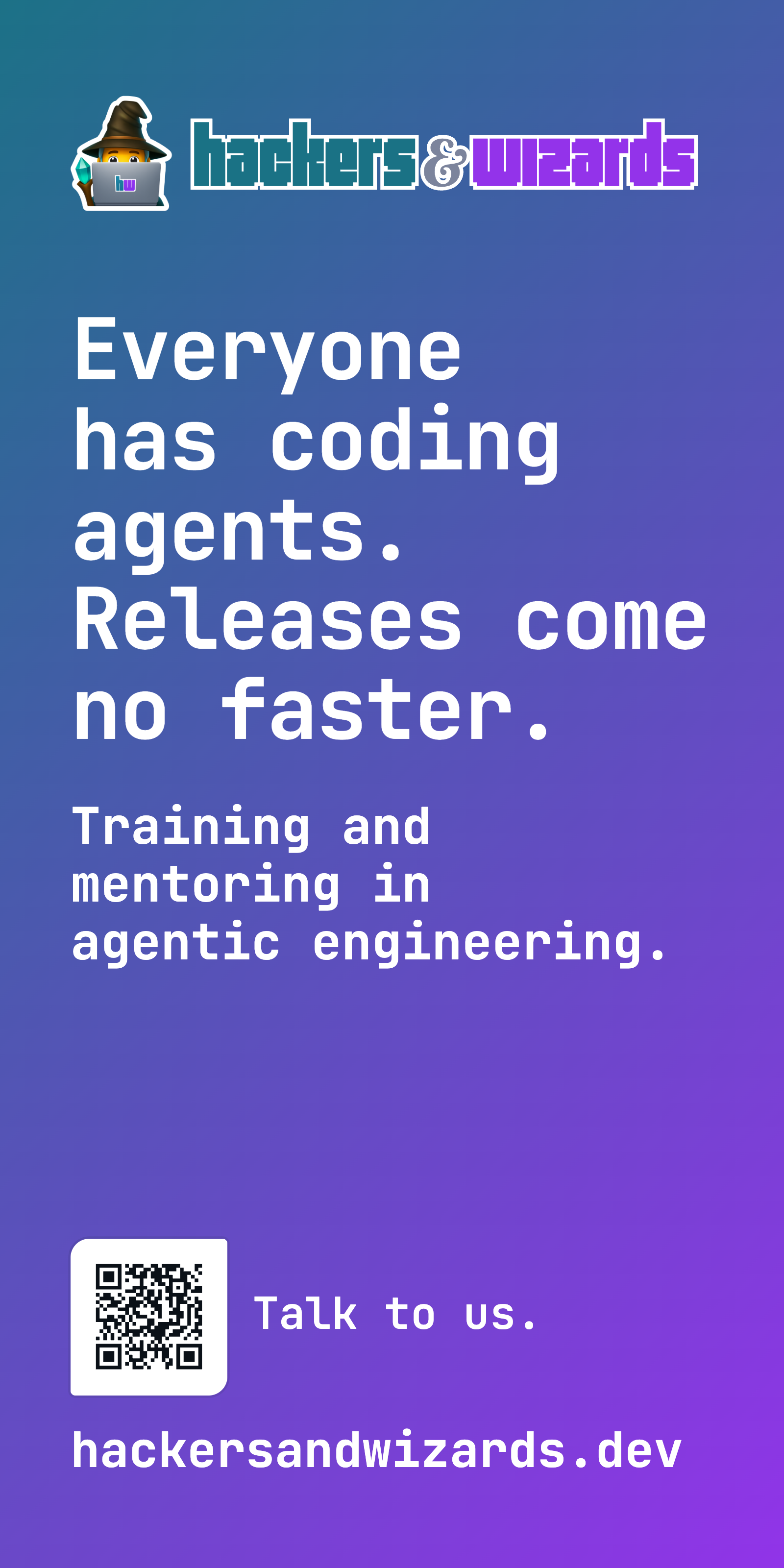
studio-display-backgroundpngPixlip frames, 1 x 2 m and 1 x 1 m: the brand gradient over the whole banner, the logo in its outline cut and only large white type. The 1 x 2 m takes the lockup, the 1 x 1 m the wordmark with the large wizard below it, whole inside the margins. Each PDF is the print file (final format plus 20 mm bleed), with a PNG preview beside it.
The airy set, one file per platform: the LinkedIn company cover with its Canva copies, both slides of the LinkedIn profile carousel, the LinkedIn Featured-link image, the X profile header, the XING and Sessionize profile covers, YouTube and OMR Reviews.

linkedin-company-cover-1512x256png
linkedin-company-cover-3024x512png
linkedin-company-cover-canva-4200x700png
linkedin-company-cover-canva-background-4200x700png
linkedin-featured-link-1200x627png
linkedin-featured-link-2400x1254png
omr-reviews-cover-1920x1080png
profile-banner-1-claim-1584x396png
profile-banner-2-clients-1584x396png
sessionize-profile-cover-2000x500png
x-profile-header-1500x500png
xing-profile-cover-1312x639png
youtube-channel-banner-2560x1440pngEvery post image, 1080 x 1350: the headline in white on the gradient band, the image as a card below it, the lockup on the tint. The package ships three commands: brand-linkedin-frame frames a photo, a sketch or a terminal; brand-linkedin-terminal renders the dark terminal window from a spec; brand-linkedin-sketch-prompt prints the prompt for a generated marker sketch and the worked examples, each sketch-example card here with the filled prompt that drew it.
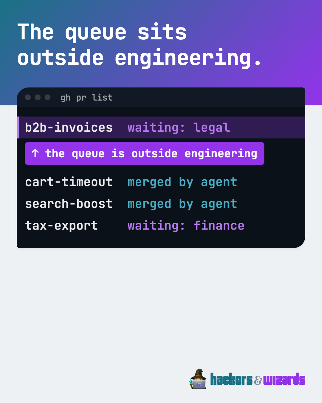
post-terminal-samplepng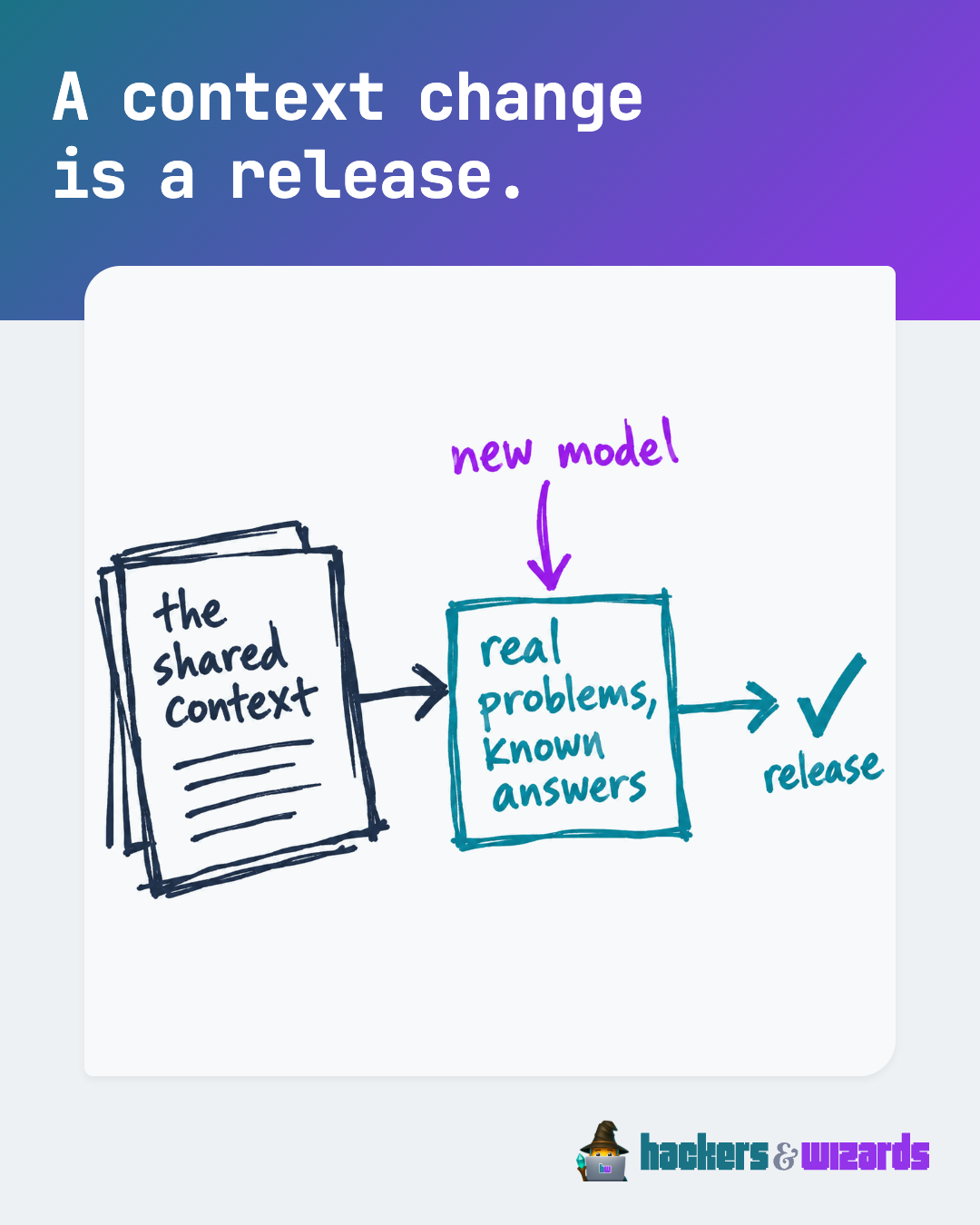
sketch-example-context-change-releasepngtxt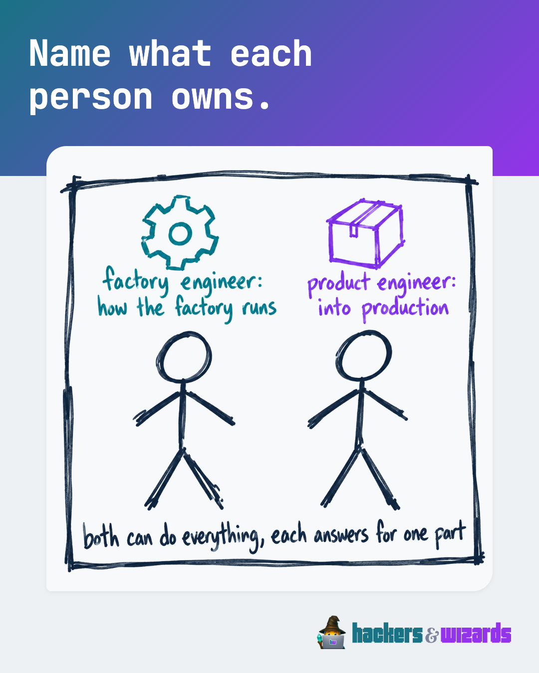
sketch-example-each-person-ownspngtxt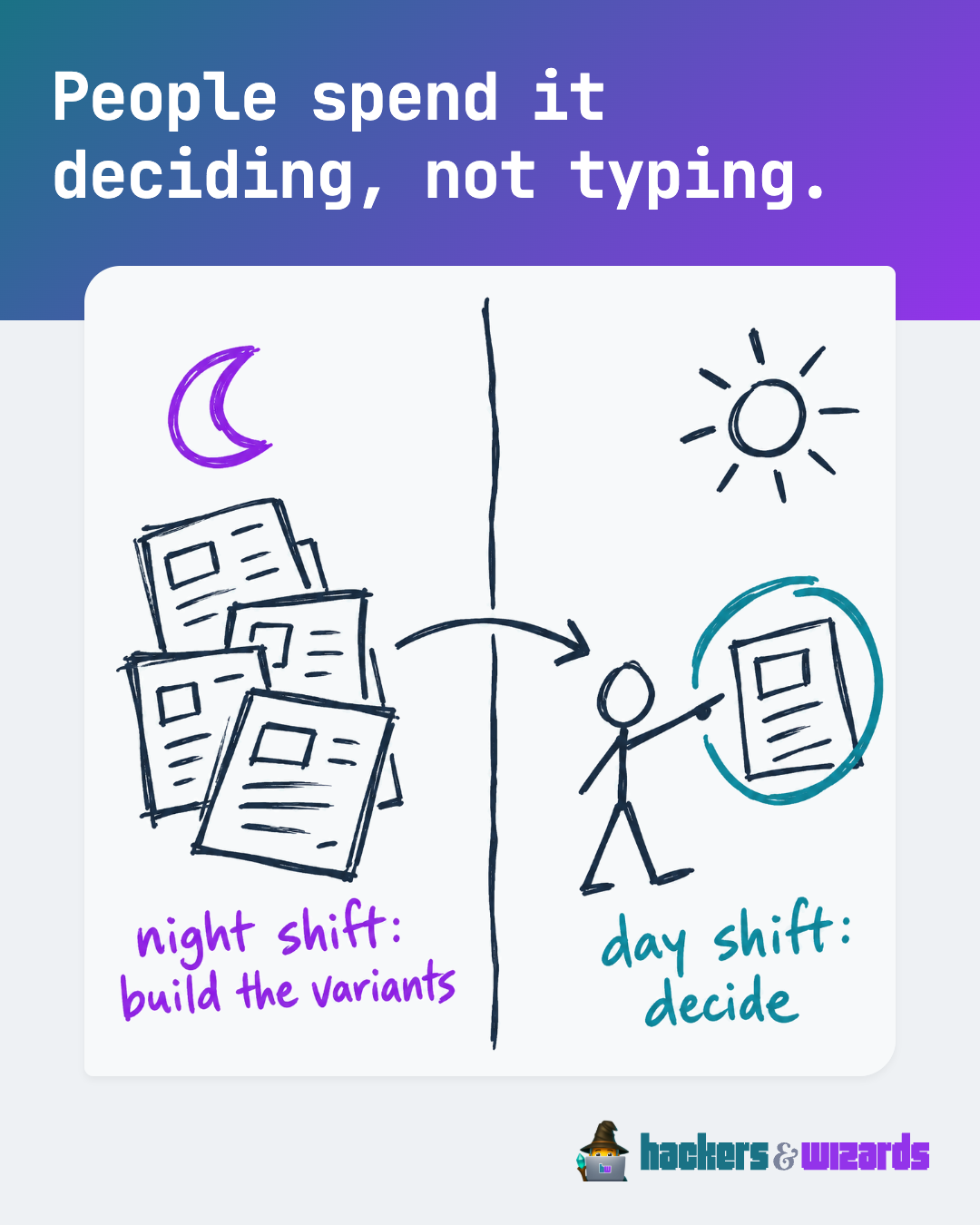
sketch-example-night-shift-day-shiftpngtxtsketch-prompttxtThe white hw on the brand gradient, one file per platform, the hw at 62.5% of the tile width, the largest that stays inside a maskable icon's safe circle; generate.ts builds them. The Google Workspace logo is the wide avatar, the hw centred on the gradient at 320 x 132. The Qonto invoice logo is the compact lockup, full width and top-aligned in a transparent 1000 px square.

circle-community-icon-32png
circle-community-icon-512png
fathom-brandfetch-logo-1024png
fathom-brandfetch-logosvg
github-org-avatar-500png
gitlab-group-avatar-192png
google-account-photo-800png
google-workspace-logo-320x132png
linkedin-company-logo-400png
notion-workspace-icon-512png
qonto-invoice-logo-1000png
slack-workspace-icon-1024png
youtube-profile-picture-800pngLinear, mesh and radial brand gradients, with the Illustrator source.

gradient-linear-01png
gradient-linear-02png
gradient-linear-03png
gradient-linear-04png
gradient-mesh-01png
gradient-mesh-02png
gradient-mesh-03png
gradient-mesh-04png
gradient-radial-01png
gradient-radial-02pnggradientsaiEach product as it is printed, drawn from its print file; each file as SVG in millimetres with a PDF beside it.
Purple Love and Stargazer. Front chest: the wordmark in the outline cut, 320 mm wide. Back neck: the same cut, 125 mm wide.
shirt-T12-front.pdfshirt-T12-front.svgshirt-T12-back.pdfshirt-T12-back.svg
Purple Love and Stargazer. Chest, above the pocket: the wordmark in the outline cut, 280 mm wide.
The compact lockup on each side, the wrap 200 mm by 80 mm.
The cover, 148 mm by 210 mm, with the lockup.
Printed edge to edge, each with the lockup.
cloth-K9.pdfcloth-K9.svgcloth-K10.pdfcloth-K10.svgcloth-K12.pdfcloth-K12.svg
Kiss-cut on night with 3 mm corners, 62 x 14 mm, 78 x 16 mm, 96 x 19 mm, 140 x 25 mm, the wordmark in the night cut 3 mm inside the edge; the print file carries the cut line (CutContour). Shown together on a 300 mm laptop lid to compare their sizes; which sticker goes where: Device stickers.
stickerP-P10.pdfstickerP-P10.svgstickerL-L13.pdfstickerL-L13.svgstickerB-B16.pdfstickerB-B16.svgstickerD-D1.pdfstickerD-D1.svg
The second motif after the wordmark: the wizard alone, die-cut with a 2.5 mm white border, 45 mm x 51 mm and 67 mm x 76 mm; Z2 goes on the laptop lid. The print file carries the cut line (CutContour) and 1.5 mm white bleed. Shown together on a 300 mm laptop lid to compare their sizes; which sticker goes where: Device stickers.
stickerZ-Z1.pdfstickerZ-Z1.svgstickerZ-Z2.pdfstickerZ-Z2.svg
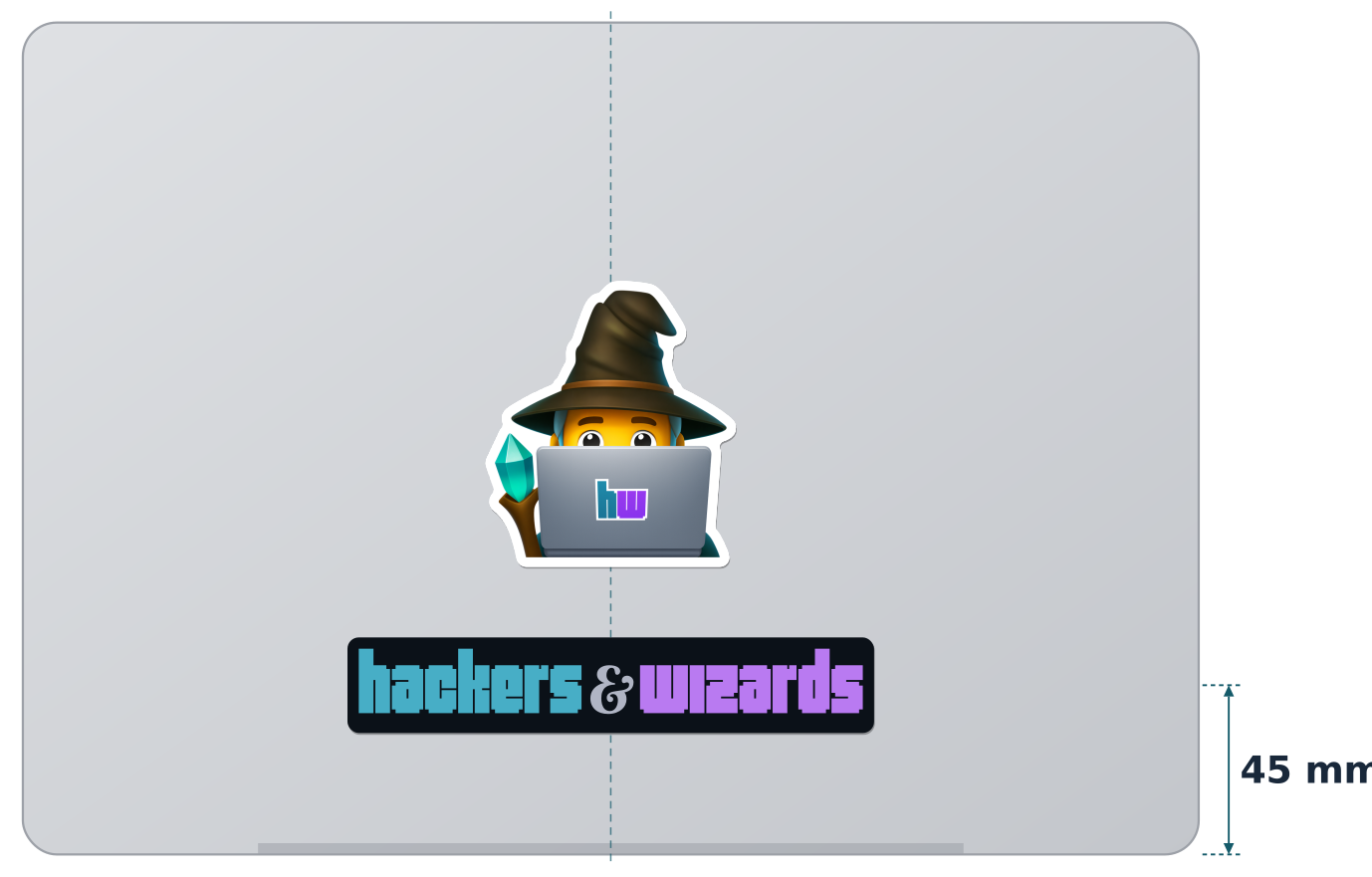
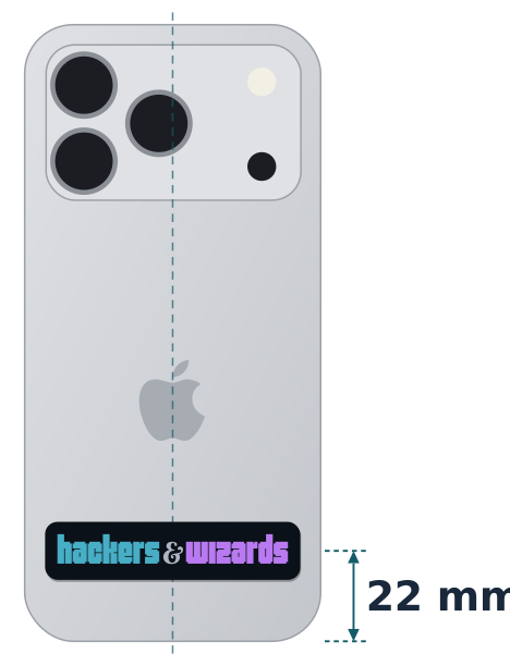
One sticker combination per company device, upright like the Apple logo and centred left to right. Drawn to scale from Apple's dimensions (MacBook Pro 14-inch, iPhone 18 Pro, iPad Pro 11-inch); the dashed line is the device's centre, the measure runs from the bottom edge to the centre of the wordmark sticker. The print files are under Merch.
One signature for every mail from an h&w account, new mails and replies alike, from one template with placeholders: the typed wordmark in colour, name, role, contact line and the three lines § 35a GmbHG requires. `bun run brand-mail-signature` writes an HTML file to open in a browser and copy into the mail client, and a plain-text file for the iPhone. Links in teal #1A7285 (5.54:1 on white). Shown with a fictitious person.
Decks come from the slide engine, the package @hackersandwizards/slides; there is no template file. Its catalog shows one slide of every type. The slide logo: the lockup on the title and the closing slide, the wordmark alone on every other slide. A concept slide that claims a mechanism in a few short cards may carry a generated marker sketch beside them: brand-slide-sketch-prompt prints the prompt and the worked example, the sketch-example card here; the slides README, "Deck structure", says which slides get one.
Proposals, rate cards, Leistungsnachweise, certificates and handouts come from the document engine, the package @hackersandwizards/documents, rendered by Company OS and the trainer hub. Its catalog shows every document type with invented data.
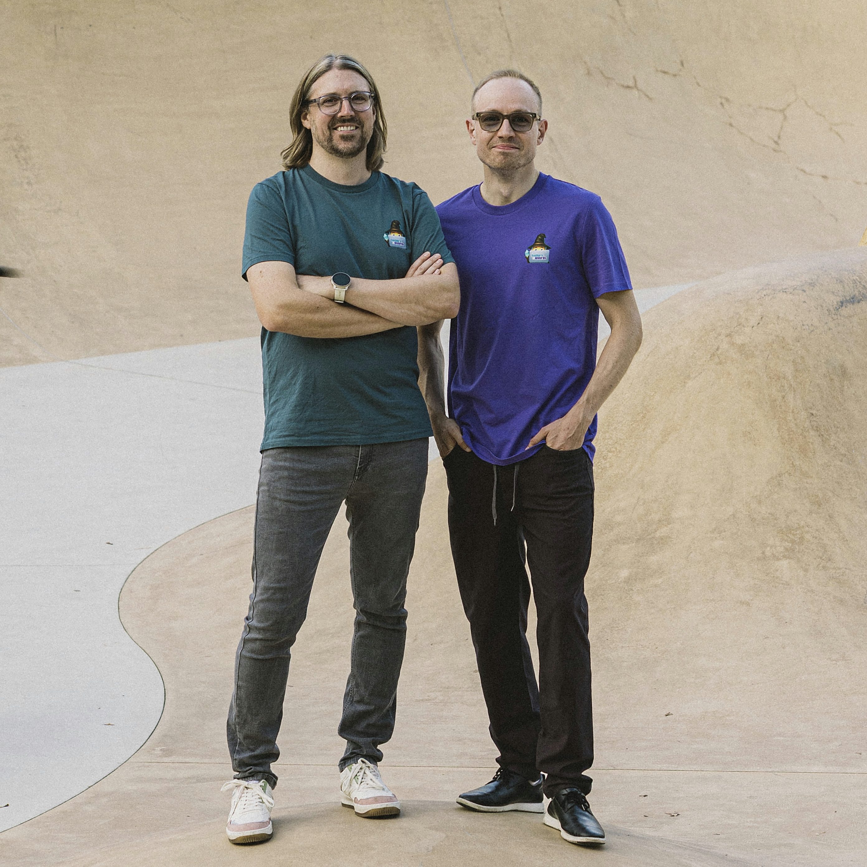
The photos of the press kit, which the website's press page offers with the logos as one ZIP. Credit: "Photo: Francesca Amann". Each photo is listed with what it shows in press/press.json.
lockupThe standard logo: the wizard beside the pixel wordmark.lockup-compactThe wizard over the wordmark, for small spots.wordmarkThe wordmark alone. Its white and black cuts carry every letter in that one colour.lockup-screenThe lockup as a smaller file (the wizard embedded at 128 px, 15 KB instead of 50 KB), identical on screen, for a header up to 40 px tall.Backgrounds for devices and callsapplications/backgrounds8 files Booth bannersapplications/booth4 filesChannel bannersapplications/channel-banners13 filesLinkedIn post imagesapplications/linkedin-visuals8 filesAvatars and workspace iconsapplications/avatars13 filesGradientsapplications/gradients11 files
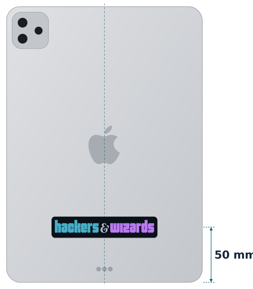 Device stickersapplications/device-stickers3 files
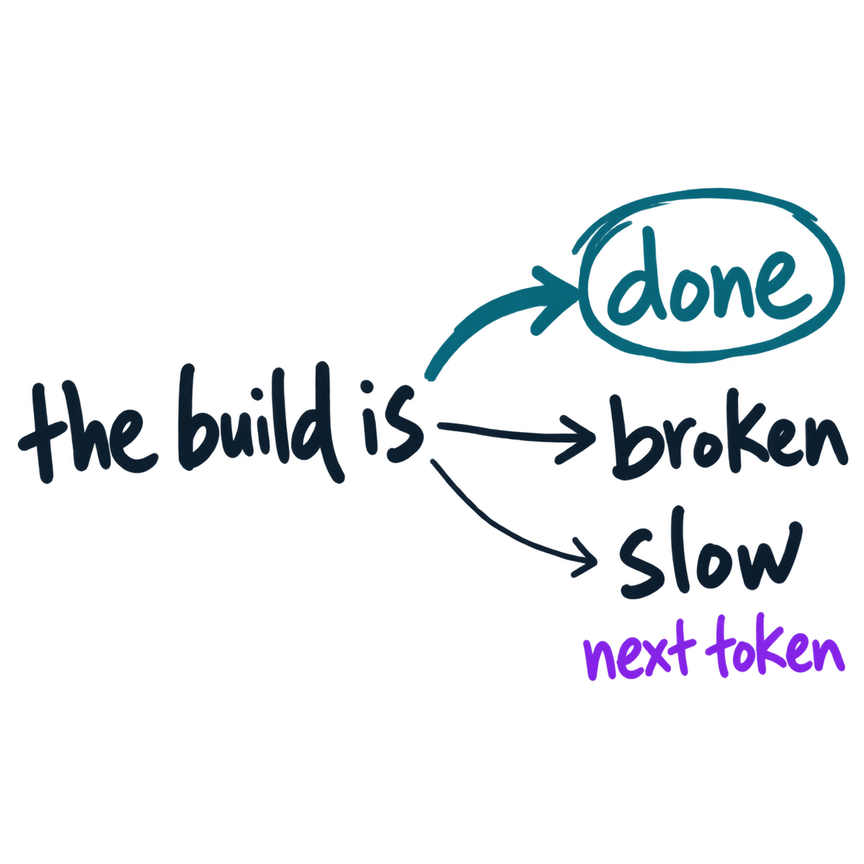 Slidesapplications/slide-visuals3 files